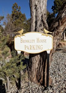
Have we arrived? Where to put Airbnb signs to direct guests.
Quick story time. Just a few months back, we were staring down an unmarked, one-way gravel road. As we craned our necks, trying to understand
Guests say no to your Airbnb before they’ve even seen your listing.
We’d bet this happens more often than any host would like to think. When guests pull up the Airbnb app and start searching for their next destination, they’re thumbing through a seemingly endless number of listings. And they’re moving fast. Really fast.
So unless your Airbnb cover photo is irresistible, guests will scroll right on by your place and never actually click on your listing. (Even if that listing is amazing!) And just like that, guest after guests says no to your place before you have even had the chance to say hello.
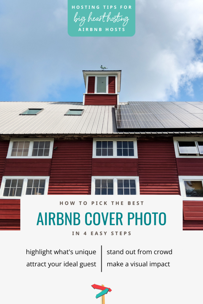
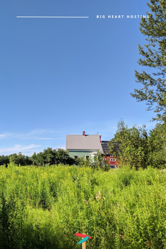
Let’s make sure your Airbnb cover photo is doing four essential things.
You’re looking for the most inviting, visually striking photo you’ve got. There are four things every great cover photo should do. Ready?
Your Airbnb cover photo should:
Any of these four goals feeling a little fuzzy? If so, here are links to related posts that can help you think through each strategy.
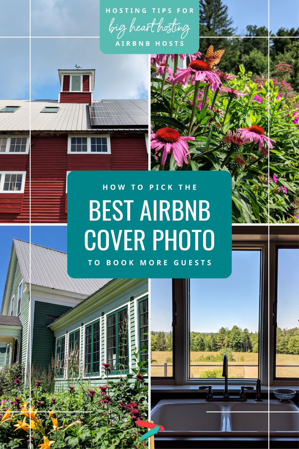
Look through your photo reel and promote your very best photo.
Here’s what to do first. Hop on the Airbnb app yourself, pull up your listing, and see whether your cover photo is successfully doing all four things above. If it is, fantastic! If it’s not, flip through the rest of your photos and see which one might perform better. More often than not, the perfect photo is already sitting in your reel and just needs to be promoted to your cover photo.

Just enter your name and email below, and we’ll send this bundle right to your inbox.
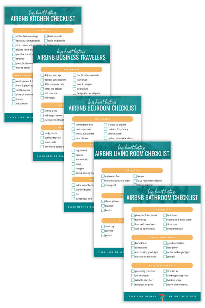
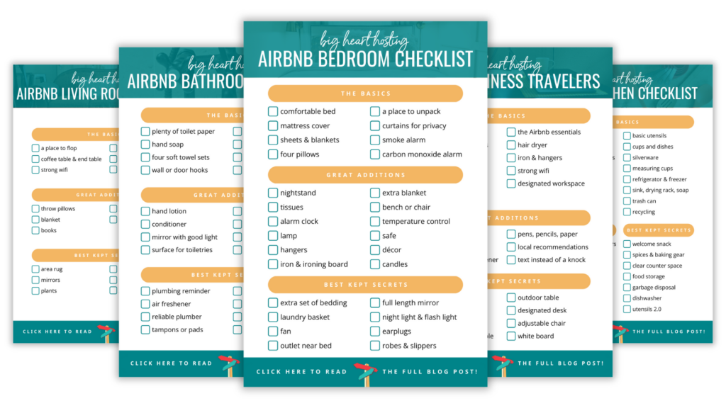
The number one question we hear from hosts is “What am I forgetting to put in my Airbnb?” This collection is the definitive answer to that question. In our signature product, we go room-by-room, step-by-step until your Airbnb is perfectly appointed and ready to impress. Bye-bye blindspots and hello happy guests!
free checklist!
Luckily all 15 of these common mistakes are super easy to fix. Grab your copy of the checklist below and dive on in!
You’re an ambitious Airbnb host with a big heart. But on some days, hosting isn’t exactly what you had imagined. Maybe it’s overwhelming. Or isolating. Or just not making the kind of money you had envisioned. At Big Heart Hosting, we’re on a mission to help hosts like you thrive, not just get by. We create step-by-step resources that bring together the best hosting strategies from around the world. We’ll give you the knowledge and community you need to create the joyful, prosperous Airbnb you deserve.
categories

Quick story time. Just a few months back, we were staring down an unmarked, one-way gravel road. As we craned our necks, trying to understand

As an entrepreneurial, remote-working couple who loves to fuse work and travel, we’re always searching for Airbnbs that can check both the work and play
At Big Heart Hosting, we’re on a mission to help hosts like you thrive, not just get by. We create step-by-step resources that bring together the best hosting strategies from around the world. We’ll give you the knowledge and community you need to create the joyful, prosperous Airbnb you deserve.
Privacy & Cookies: This site uses cookies to improve your experience. By continuing to use this website, you agree to their use. See our Privacy Policy to find out more, including how to control cookies.
Hello! We’re honored to be a small part of your hosting adventure. We truly love connecting with hosts one-on-one. Send us a message here, and share what you’re creating. We can’t wait to celebrate with you!
Copyright © bnbNomad, LLC. All Rights Reserved
Download our most popular free hosting resource now!
THE AIRBNB BEGINNER CHECKLIST BUNDLE
Download our most popular free resource now!
